About Wall Art Discusses Bold Versus Muted Color Trends in Home Decor
Online retailer About Wall Art has analyzed current home decor trends, focusing on the contrast between bold and muted color palettes. The company notes a division among consumers regarding these styles.
Online retailer About Wall Art has published an analysis of current home decor trends, highlighting a contrast between bold and muted color palettes. The company observes that consumers are often divided between adherents of these two distinct aesthetic approaches.
Bold colors, characterized by vibrant hues such as deep reds, electric blues, and sunshine yellows, are used to inject energy and personality into living spaces. These selections appeal to individuals aiming to create dynamic and impactful interiors. About Wall Art offers a selection of artwork designed to complement these vibrant themes, encouraging customers to incorporate strong colors into their designs.
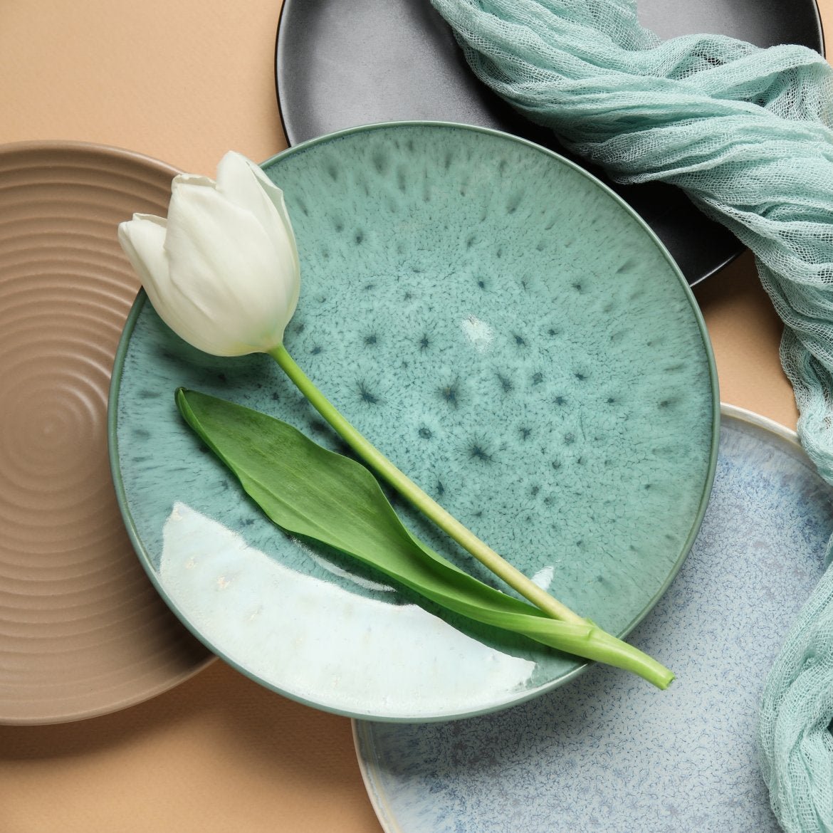
Conversely, muted colors, encompassing neutrals like beige, grey, and earth tones, aim to establish a calm and serene environment. This approach appeals to those seeking tranquil domestic settings. The retailer provides art pieces and decor items that enhance these peaceful atmospheres, facilitating the creation of harmonious and timeless living spaces.
About Wall Art emphasizes that neither trend is inherently superior, with the choice ultimately depending on personal taste and the desired ambiance. The company's product offerings aim to cater to both preferences, providing a diverse range of styles and color schemes to suit various customer needs.