Coca-Cola Unifies Can Design as Strategic Shift
Coca-Cola has revealed a new global visual identity standardizing all product variants into a uniform design. The strategy aims to leverage the core brand's equity to drive adoption of sugar-free options.
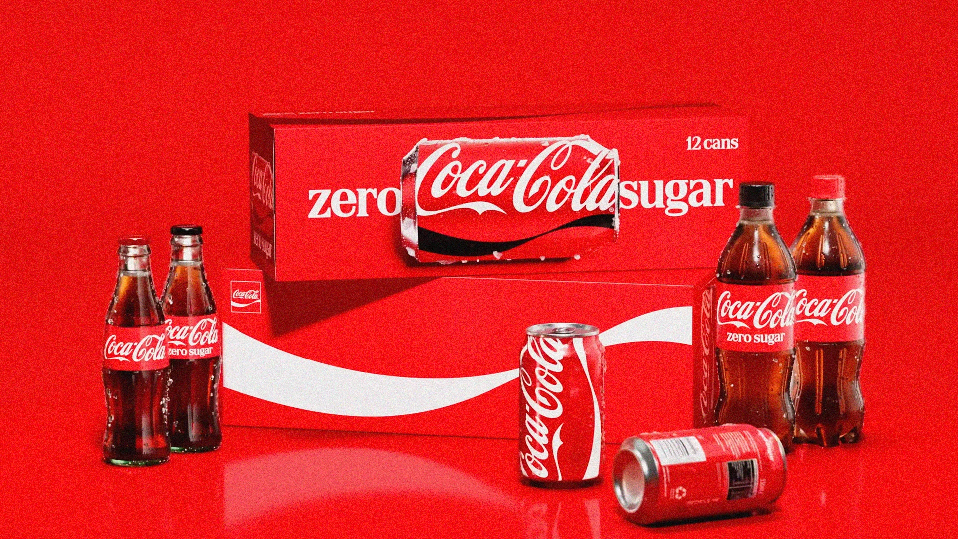
Coca-Cola is rolling out a new global visual identity that unifies all of its product variants under a single, consistent design. The update, implemented across over 200 markets, heavily features the signature red and white color scheme, with the Zero Sugar version distinguished by a thin black ribbon.
Critics have noted that the new design makes variants harder to differentiate, leading to potential confusion for consumers. This ambiguity is widely seen by marketing analysts not as an oversight, but as an intentional strategy to leverage the iconic brand's high equity.
The company appears to be strategically blurring product lines to encourage trial of its sugar-free options. By anchoring the health-conscious SKU to the main brand's established look and feel, Coca-Cola aims to lower the psychological barrier for consumers to choose Zero Sugar, accepting a baseline level of confusion as a trade-off.
This convergence is seen as a deliberate portfolio strategy, according to former Coca-Cola executive Courtney O'Brien. She suggests the company is absorbing the equity built by Coca-Cola Zero Sugar back into the primary red branding, making the company name and color the central heroes rather than the sugar content.
This move signals a long-term plan to promote healthier alternatives and potentially reduce reliance on traditional sugar-sweetened beverages globally, using brand recognition as a primary driver.