Coca-Cola's new visual identity sparks comparisons to cigarette branding
Coca-Cola has unveiled a new global visual identity featuring a vertical wordmark that has drawn comparisons to Marlboro's font. The redesign retains the brand's iconic red and white color scheme.
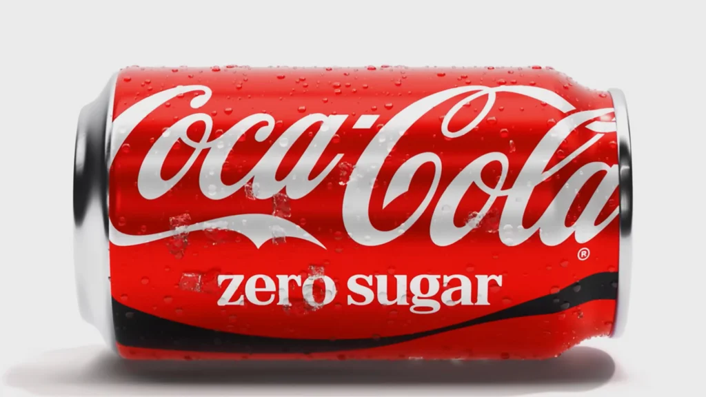
Coca-Cola has introduced a new global visual identity that has generated significant online discussion due to perceived similarities with cigarette branding. While the brand's signature red and white color palette and core logo remain, the updated design places the "Coca-Cola" wordmark vertically on cans. Additionally, all product varieties now share the same logo color, a departure from previous distinct colorings, such as the black lettering previously used for Coke Zero.
The new identity leans heavily on the brand's iconic "ribbon" element, which can be adapted for various media from static cans to dynamic video. However, a serif typeface used in the redesign, created by Brody Associates, has drawn particular attention for its resemblance to the font used by Marlboro cigarettes. Social media users have noted the similarity, with some expressing concern about a beverage brand evoking tobacco imagery. This discussion also intersects with a recent social media trend using the term "fridge cigarette" to describe a Diet Coke as a guilty pleasure.
Coca-Cola stated that the redesign aims to build a stronger foundation for growth while maintaining brand recognition. "Coca-Cola is one of the most recognized brands in the world, and with that comes a responsibility to keep evolving," said Arnab Roy, President of Coca-Cola Global Category. The company emphasized that the update honors existing brand equities and prepares assets for contemporary platforms.
The visual identity draws inspiration from past Coca-Cola designs, including the Arden Square element from 1969. This approach appears intended to leverage brand history and nostalgia. While some critics have focused on the alleged font similarities, others have praised the redesign for reinforcing the brand's legacy and suggesting a confidence in its established identity amidst a culture of disposability.