Instagram updates wordmark for first time in a decade
The social media app Instagram has unveiled a new wordmark, its first major logo redesign in ten years. The new design partially abandons the previous cursive font while retaining some of its elements.
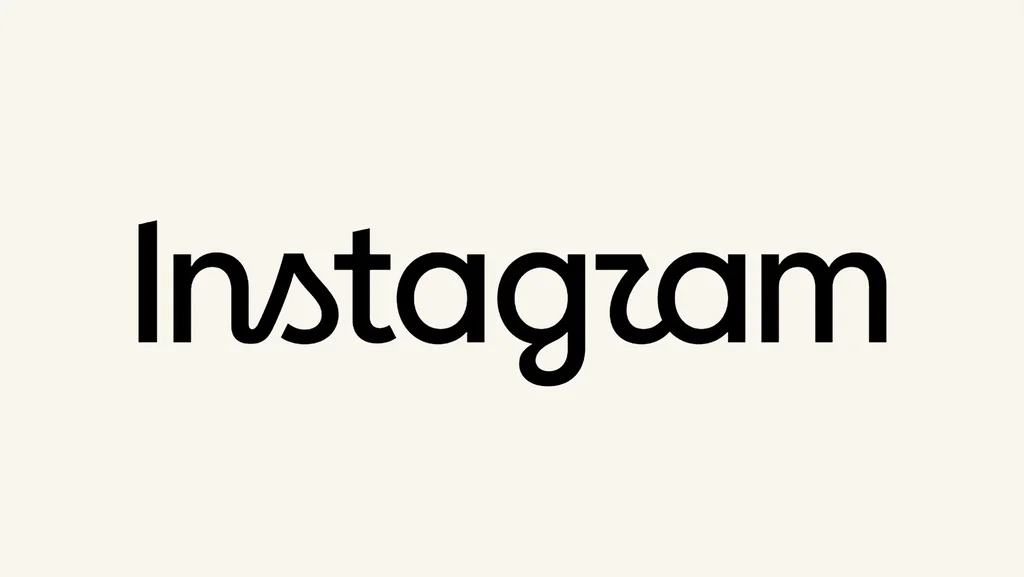
Social media platform Instagram has introduced a new wordmark, marking its first significant visual overhaul in a decade. The updated design aims for a more modern and streamlined appearance while aligning with the visual identity of Meta's sister applications, including Facebook and Threads.
Instagram's head, Adam Mosseri, announced the change via an Instagram post, stating that the wordmark at the top of the app was due for a refresh after ten years. The new design moves away from Instagram's iconic cursive font but incorporates subtle nods to its previous style, such as connected 'n' and 's' characters and playful flourishes on the 'r' and 'g'.
The shift moves Instagram visually closer to the Meta family of brands, adopting a sans-serif typeface. This style is also present in the wordmarks for Facebook and Threads. Notably, Threads updated its own visual identity in May, seeking to establish itself as a distinct platform beyond its association with Instagram.
The redesign has sparked user discussion. Some users have expressed criticism, finding the new wordmark confusing and difficult to read, with some likening it to "Instagzam." Conversely, others have welcomed the change as a modernization. A number of users have also expressed a sense of nostalgia for the previous logo.