Major League Baseball completes multi-year visual rebrand
Major League Baseball has updated its brand identity with a new suite of custom typefaces. The project, led by Mother Design, focuses on integrating the league's 20th-century history into a modern digital system.
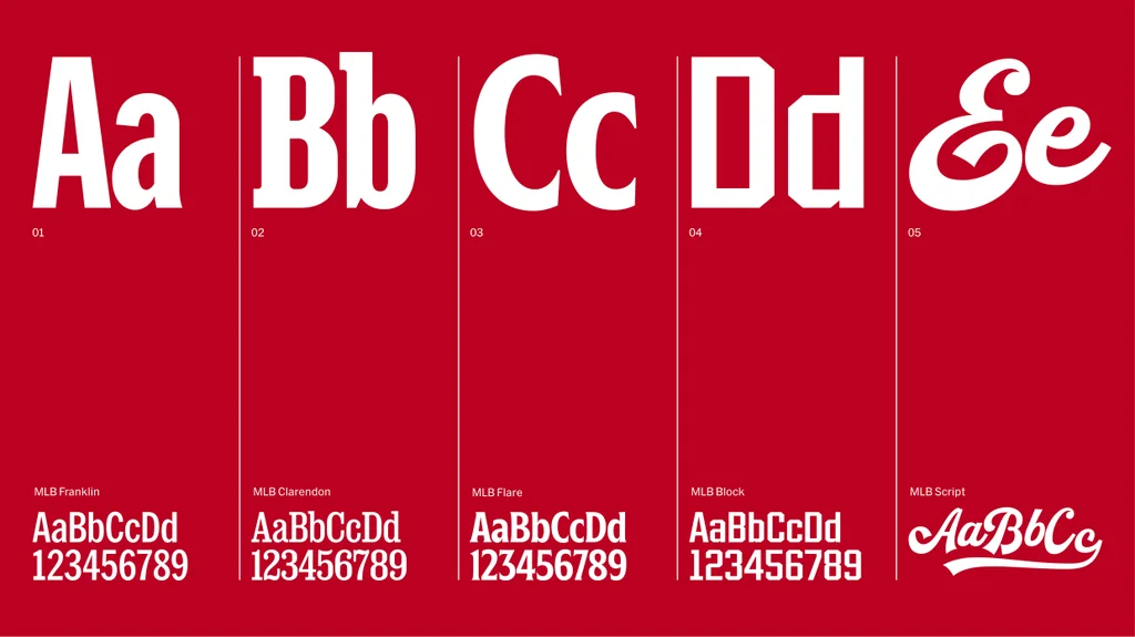
Major League Baseball (MLB) has finalized a comprehensive brand refresh, introducing a new visual system that spans its digital apps, social channels, and physical venues. The project, which began in 2022, was managed by the agency Mother Design to unify the league's aesthetic identity while maintaining its historical recognition.
The update centers on the introduction of five custom typefaces—MLB Franklin, MLB Clarendon, MLB Flare, MLB Block, and MLB Script. These fonts were developed by various typography experts to replace older, inconsistent branding elements. Each font style references specific design eras of early 20th-century baseball, drawing inspiration from artifacts such as vintage ticket stubs, stadium signage, and classic uniform lettering.
While the core silhouetted batter logo remains untouched, the new typography allows the league to maintain a consistent presence across diverse formats, from small smartphone screens to large stadium scoreboards. Designers involved in the project noted that the goal was to ensure the visual cues remained recognizable to long-time fans while meeting modern digital display requirements.
Mark Sloan, head of design at Mother Design, stated that the project aimed to honor the visual vernacular of the sport, which he describes as a reflection of American history. The rollout of these new design elements has been ongoing since early 2024.