Norway's World Cup Jersey Font Balances Heritage and Readability
Norway's national soccer team will feature a new font, Taakeferd, on their jerseys for the 2026 World Cup, inspired by ancient runes. The typeface balances cultural heritage with FIFA's readability requirements.
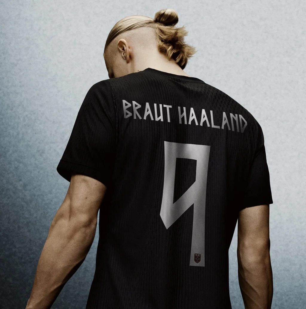
Norway's national soccer team's jerseys for the 2026 World Cup will showcase a new font, Taakeferd, which draws inspiration from ancient runic script. Developed in partnership with Nike and the Norwegian Football Federation, the typeface addresses previous readability issues while honoring Norwegian heritage.
Initial attempts to use a runic-inspired font for player names and numbers on Norway's kits proved difficult to decipher, particularly from a distance. FIFA regulations mandate that jersey typography must be clearly legible and distinguishable, a requirement that the previous design failed to meet. This necessitated the creation of a new solution that complies with international standards while maintaining a distinct Norwegian identity.
The font's name, Taakeferd, meaning 'journey through the fog' in Norwegian, alludes to the team's return to the World Cup after a 28-year absence. The design incorporates the angular strokes and geometric lines characteristic of runic alphabets, adapting them into a modern Latin letterform. The objective was to achieve a look that is both contemporary and clear, yet deeply rooted in Norway's history.
Nike stated that extensive research informed the development of the Taakeferd font. According to the design team, the angularity and sharpness of the runic alphabet were preserved, but the typeface was modified for clarity and a modern aesthetic. Multiple iterations of letters and numbers were created before the final version, prioritizing legibility, was approved. The home kit is inspired by Norway's flag, while the away kit is all black, both featuring the distinctive typeface for names and numbers.
Runic alphabets were used in Nordic and other European regions until approximately the 17th century. Their angular letterforms continue to inspire contemporary type designers. The Taakeferd font translates this typographic history for a global audience within the context of international sports, offering players a unique Norwegian element on their jerseys.