Novo Nordisk shortens name to Novo in brand refresh
Novo Nordisk, the Danish pharmaceutical company behind Ozempic and Wegovy, has rebranded to "Novo" as part of an effort to appear more consumer-friendly.
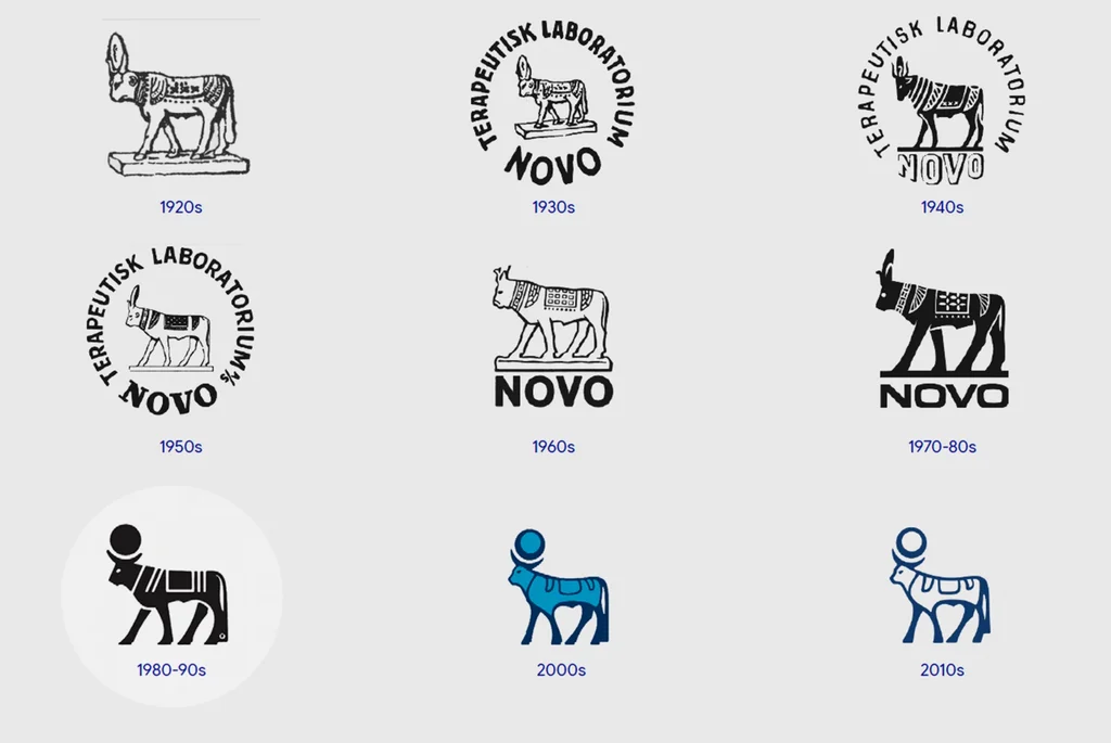
Novo Nordisk, the Danish pharmaceutical company known for its weight-loss drugs Ozempic and Wegovy, has shortened its name to Novo as part of a significant brand refresh. The change, effective this week, aims to make the company's identity more accessible and modern.
The rebranding reflects a broader trend within the healthcare industry, where pharmaceutical companies are moving away from sterile, clinical branding to appeal more directly to consumers. This shift is influenced by the rise of telehealth and direct-to-consumer health services. The new name and visual identity are intended to capture consumer attention in a competitive market, particularly against brands that now offer medications directly to patients online.
The updated visual identity features the shortened name in a contemporary sans-serif font. The company's long-standing Apis bull logo has also been simplified and modernized, now facing right instead of left. The color palette has been updated with a deep cobalt blue, dubbed "Lasting Blue," and a bright turquoise accent.
Novo Nordisk also introduced a new tagline, "Lasting Health Starts Now." CEO Mike Doustdar stated that consumer expectations for healthcare are evolving, demanding services that are more responsive, relevant, and easier to integrate into daily life. This rebrand is positioned to meet these evolving needs and connect better with younger demographics.
The move comes amid increased competition in the GLP-1 drug market. Eli Lilly currently holds a larger market share, with 60.9% compared to Novo Nordisk's 38.8%. Lilly has made inroads with new oral weight-loss medications, narrowing Novo's lead. The simplified name "Novo" seeks to foster a more human and approachable brand image in a pharmaceutical landscape that increasingly emphasizes connection and user-friendliness.