Samsara rebrands with construction yellow to reflect physical operations
Connected operations company Samsara has replaced its blue, tech-oriented logo with a distinct yellow color scheme to better represent the company's focus on the physical world.
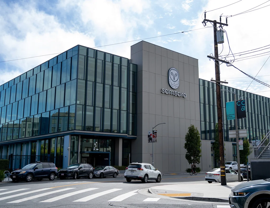
Samsara, a company providing software and solutions for fleet and physical operations management, has undergone a significant brand refresh. The new visual identity, featuring a prominent yellow color and a bolder logo, aims to communicate the company's focus on the physical world and the asset-heavy operations of its clients.
The company serves industries such as logistics and transportation, with customers including DHL and Hertz, as well as in-home service providers like Sears Home Services. Samsara's solutions are designed to improve routing, enhance safety, and reduce incidents, directly impacting operational costs for these businesses.
The rebrand coincides with Samsara's substantial growth, fueled by factors like AI data center construction, government infrastructure investments, and waste intelligence. The company announced 30% year-over-year growth in June, with nearly $2 billion in annual recurring revenue.
Creative studio Base Design developed the new visual identity based on feedback from Samsara's customers. The central theme of "build with" underpins the rebrand, blending a technical aesthetic for software development with a more tactile, field-oriented feel through the use of signal yellow and handwritten elements, reflecting collaboration with customers and frontline operators.