Trump's Lake America Font Underscores New Name's Silliness
President Donald Trump used his administration's official font for a lake renaming. Instrument Serif, intended to convey seriousness, was widely perceived as comical.
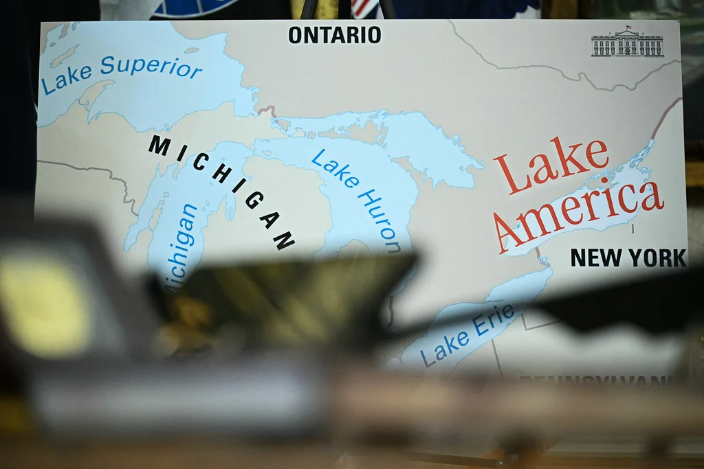
President Donald Trump employed his administration's official Instrument Serif font when renaming Lake Ontario to "Lake America." The choice raised questions, as the typeface was widely perceived as amusing rather than serious.
The administration's decision to rename Lake Ontario occurred amid escalating trade tensions between the U.S. and Canada. Posters used as visual aids featured "Lake America" in Instrument Serif, a font designed to convey gravitas, but which many found to look dated or even comical.
In official communication, typography choice is crucial for conveying credibility and authority. Government documents and communications typically aim to use fonts that reflect formality and the weight of the state. For instance, Trump's previous White House administration used Merriweather, while Joe Biden's administration used Mercury.
The use of Instrument Serif for the "Lake America" designation, viewed by many as a political stunt, has drawn criticism. The font's application in such a context has been compared to previous communication missteps by the Trump administration, such as altering a hurricane's projected path on a map with a marker.
Critics argue that such actions undermine the credibility of the font, and by extension, the administration itself. Ontario Premier Doug Ford described the renaming as "something out of Saturday Night Live."